TraShelter
Brand Design & Advertisement
Designer
In the U.S. alone, up to 43% of homes are at high risk of a natural disaster striking. Disasters occur all across the country, leaving thousands of people without homes and belongings, and our mission is to provide an economical and temporary shelter during these times of struggle. TraShelter aims to work with the government to continuously aid those in need by immediately providing shelter following a crisis.
ABOUT TRASHELTER
TraShelter is an NPO that builds temporary shelters for victims of natural disasters. TraShelter takes recycled materials and uses them as building materials in these temporary housing units. Recycled materials are found all over the country. These units are portable, and the quality of these units is tested on Rensselaer Polytechnic Institute’s campus by engineers, designers, and students of our team. Once tested, they are then shipped to locations following a crisis with the transportation made possible by the municipal division of the country.
Our shelters provide electricity through solar panels built into the roof or through wiring inside that can be hooked up to an external power source. The shelters will come in multiple sizes, from individuals and couples to families. These shelters will be shipped flat and set up on arrival, with detailed instructions so anyone can build them.
THE NAME and LOGO
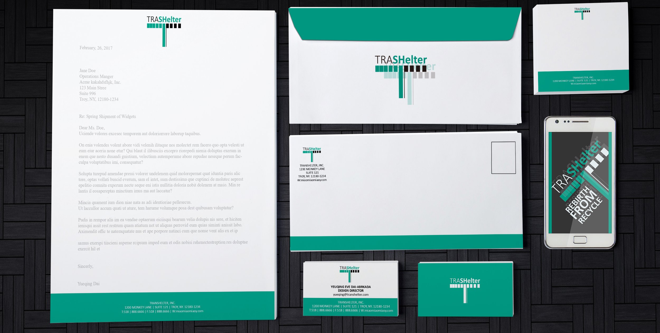
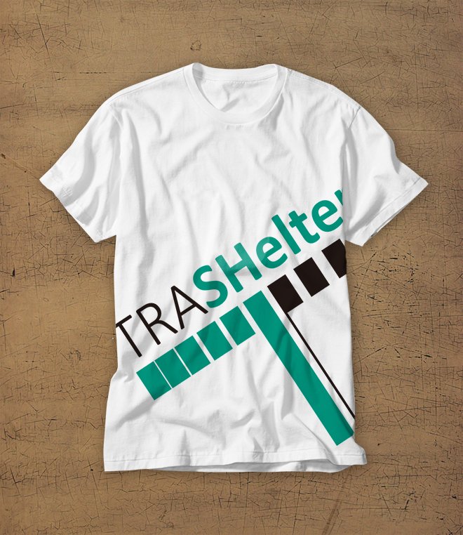
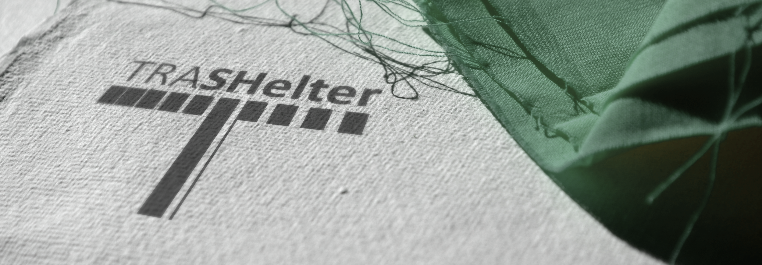
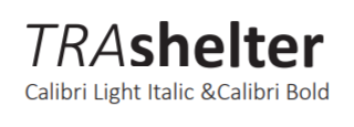
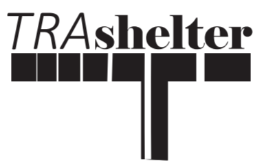
The objective of the business is to use recycled plastic and other refuse to create shelters and temporary housing for those in need. The name of the business is the combination of "trash" and "Shelter." The word "TRASH" is capitalized in the logo, and the word "shelter" is bolded. This makes it easy for others to understand that it is a combination of two words. The whole name uses Calibri, which makes it a cohesive whole. The graphic logo under the name looks like the capital T, which is the beginning of the name. It also depicts the shelters and the support. The unequal interval inside the logo shows transition, representing our goal to change trash to shelters.
The color of the logo is green. It is Green U in PANTONE+ Solid Uncoated. Green represents recycling. It also represents hope, which the business wants to bring to our customers. Half of the logo and the word "shelter" are in green which again shows the transition. It also represents our wish of changing the dark and useless trash into green and useful shelters to help others.
The background of the white logo is a shelter in the forest. Although it is not made of plastic, it shows the feeling of support, which TraShelter wants to provide to our customers.
LOGO DISPLAY


DESIGN PROGRESS









ADVERTISEMENTS
These advertisements use emotions to communicate the message to the audience. The target audiences are the people who can support TraShelter to make more shelters.
To achieve the aim, several slogans have been designed for different uses. All slogans are designed to be short but powerful.
Headline:
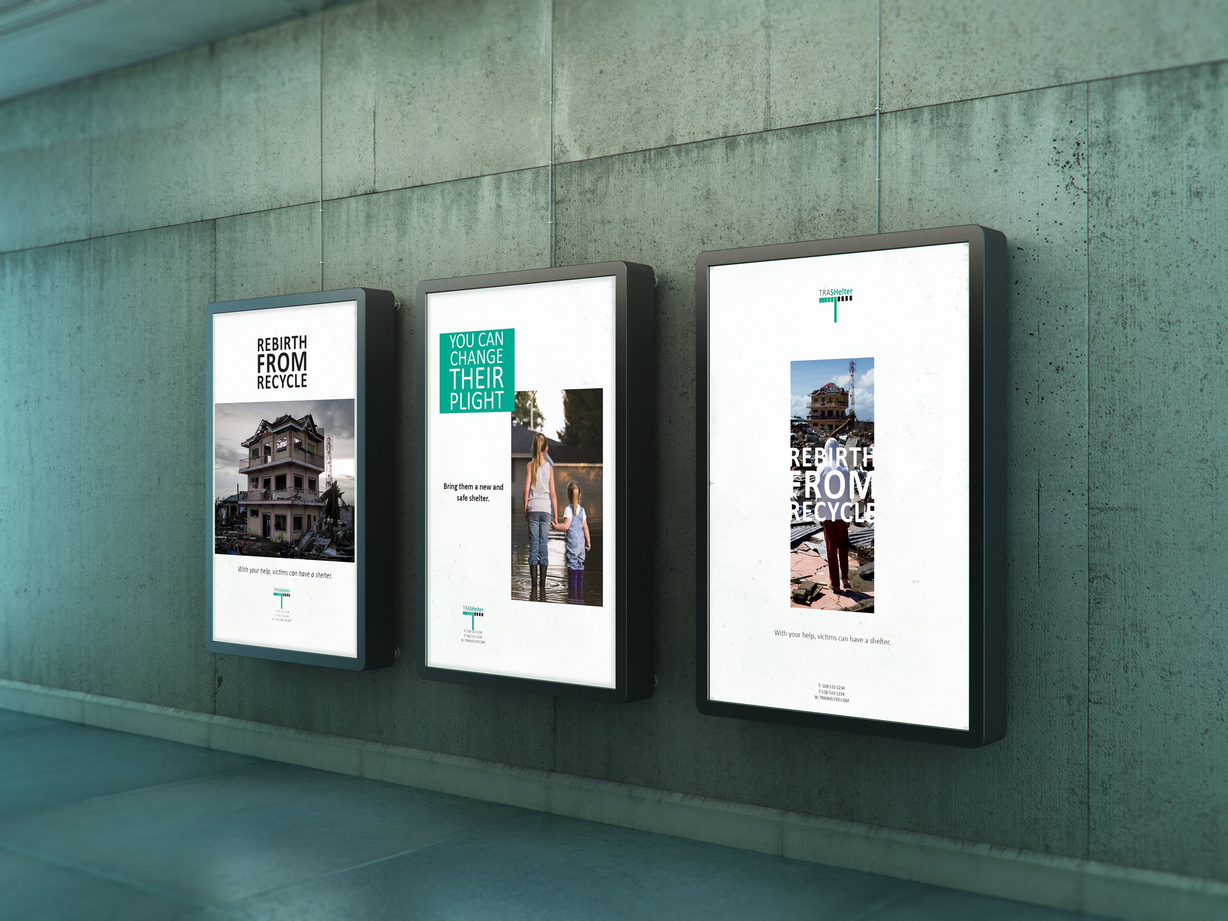
- REBIRTH FROM RECYCLE
Headlines should be short and simple but powerful. As a result, we chose two words that start with “re” to emphasize the key point of TraShelter: rescues and reuse of the material. Also, all the letters are capitalized to catch their eyes.
Sub-headline :
- With your help, victims can have shelter.
Directly talk to the customer. Reduce the distance between Trashelter and the customer. Tell them how large of an impact they can have on the victims.
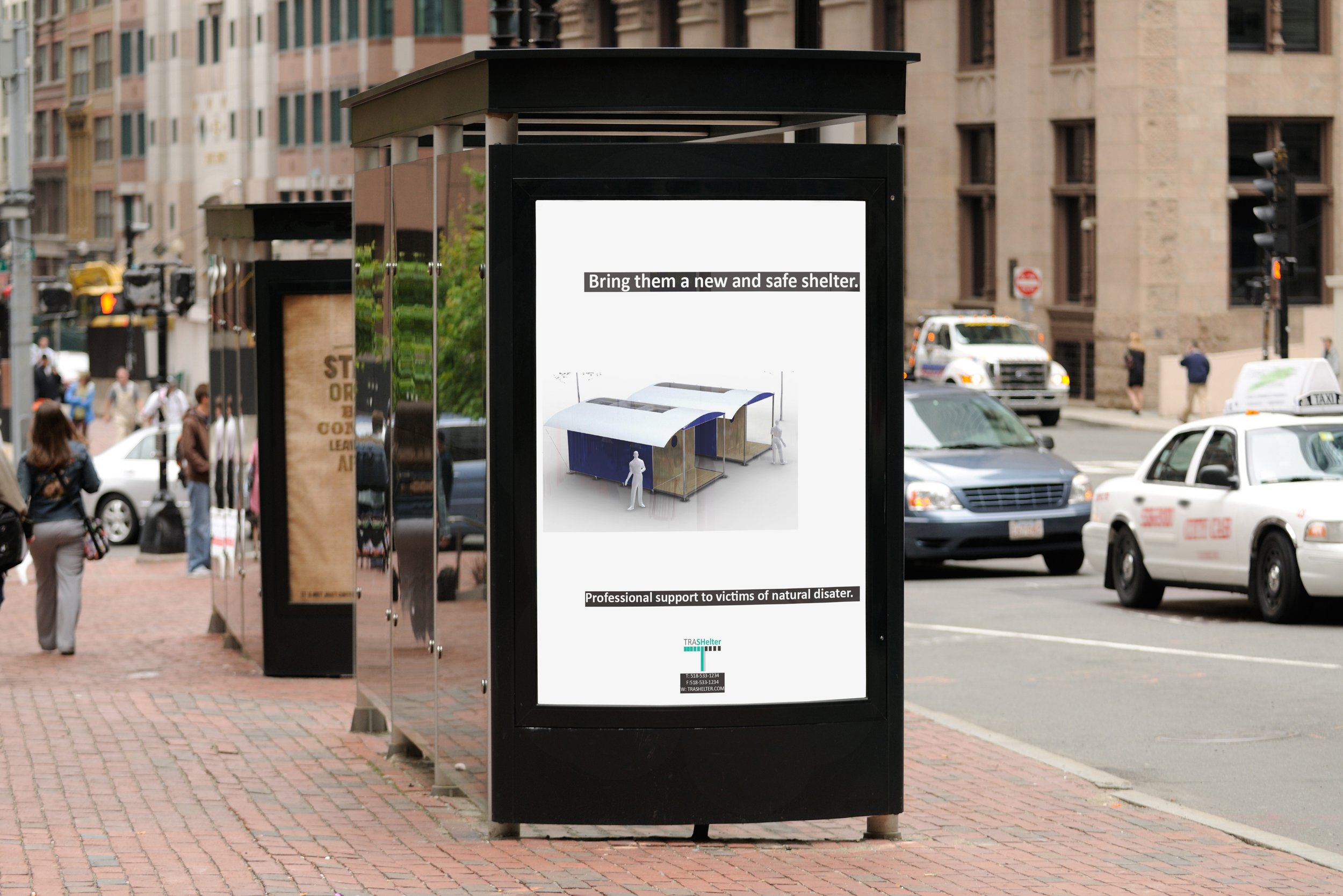
- Bring them a new and safe shelter.
When saying new and safe, we want to point out that the victim now might be living in an old and unsafe environment and how sad they are. This is trying to evoke their sympathy and lead them to help.
- Professional support to victims of natural disasters.
This sub-headline simply wants to show the customers that we are professionals. If the customer wants to help, he/she can come and find us for support.
- YOU CAN CHANGE THEIR PLIGHT
Following the headline, this sub-headline tries to convince the customer that they have the power to rescue the victims. Compared to the first headline, this one is more direct and a call to action to the customer.
Poster Design
To support the headline, one picture shows a homeless victim looking at his wrecked house, and the other picture shows the “rebirth.” With the help of the audience and Trashelter, victims now have a temporary shelter to live in. The sub-heading also supports the pictures. The sub-headline points out that rebirth happens when the audiences show their support.



MORE DESIGN
