Kwakwa Island Documentation
General Background
Kwakwa Island is a website designed for Connections Lab - IMA Low Res Fall 2022.
Kwakwa Island is a website that allows the user to praise and be praised.
Works for PC and mobile.


Key concept and/or intention
Many people in Asia, including myself, is grown up with a didactic education. We are hardly honored by our parents or teacher. As a result, when we grow up, we find that we don't know how to praise others and lack self-confidence. Praise means so much to us, and also, it is something far away from us. Therefore, I plan to make a social platform for praise and be praise. Also, sometimes we don’t have the opportunities or don’t know whether it is a good time to say good words.
As a result, I want to create a comfortable place for everyone to say good words are receive praise.
Production decisions
Main Idea
I plan to put the conch and the drift bottle together. Each "sea" has its own topic (music, work, grade, and other life-related topics or private sea with group names like "Sea of IMA Low Res" ). In the "sea," there are many islands. The user will have their own beach on the island. They can post topic-related things on the beach. They can also visit other users' beaches. The most important feature is that the users can "whisper" their praise to a conch and through it to the sea. The award can be anonymous if the user wants since I know someone around me are too shy to praise others although they want to. The glorified person will then see a conch on their beach. They can collect the conch and see the honor. The conch has different skins to collect. Also, conches would randomly be sent to the users by the system.
The minimum viable product would only have one "Sea of IMA Low Res." The users can create an account, join the sea, send conches to others, and receive and collect conches. The administrator can do the content review. The system can randomly send conches under specific rules.
User Agreement
At the very beginning, to make sure all the text in the conches is words of praise, I need the user to sign an agreement at the very beginning. All conch will go through the content review by the administrator before being sent to the target users. During the class, Beth mentioned that since this proof of concept is for our IMA Low Res, a safe and warm environment, the content review function can be implemented later. As A result, I change the agreement into a little ceremony - read a sentence.
The idea comes from the use of Marauder's Map in Harry Potter. To view the map, one should tap it with one's wand and recite, "I solemnly swear that I am up to no good." I believe this action can create an immersive atmosphere for the project.
Read out loud before entry
Color Palette and Visual Design
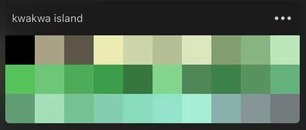
The key visual elements are the sea, the islands, and the conches. I don’t want the users to pay too much attention to the visual design, and I want to create a peaceful environment, so I choose to use the 2D form. Also, the saturability should not be too high. Otherwise, it would be too eye-catching. Since the main idea is to create a soft and cozy space, most of the elements on the website don’t have outlines. I use the map in Animal Crossing: New Horizons as a reference, and here are the colors I choose to use.
Map in Animal Crossing: New Horizons
Color Palette used in Kwakwa Isalnd
Next, I design the main Island. In the future, The user can choose where they want to live on this island. This is a conch-shaped island with beaches, hills, creeks, and lakes.
After, more islands are added to the map with different visions to make the main island looks not alone. There will always be people around you. One of them becomes the background of the website.
The conches are the most colorful thing in the project since they are the key elements to bringing happiness to the users. I plan to and more shapes and colors in the future, I also plan to add animations when the user is interacting with the conches.
Code Structure and Database
Instead of Socket.io for RTC, NeDB is used for this project. One reason is that RTC is not necessary for this proof o concept. Also, instead of learning a new MongoDB, I am more familiar with NeDB. The most important reason I did not choose to use RTC is I don’t want it to be real-time. Inspired by Slowly (One of my favorite social apps), an APP that hopes to connect people around the world at a slower but better pace – one letter at a time, I believe waiting can create something real-time connection cannot. Every time the user checks, the magic is a gift. More details about the code will be discussed in the next section.
Screen shoot from Slowly’s website
Major Challenges and Solutions(if applied)
Many hard code “skills” are used to finish the project on time, which is a bad habit.
File organization
I place all the images in the ‘img’ folder at the beginning. But “img/name, jpg'“ doesn’t work for some reason. As a result, I put them directly in the folder of the code.
Page switch
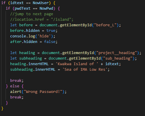
I plan to make the login and the main page into two different sub-pages. But I did not find an easy way to deliver the user and the username. All the solutions I found use SQL or PHP and are hard to learn and understand in a short period of time. As a result, I used a tricky way. Hide all the elements for the main page at first. When the user successfully logs in, hide elements for the home page and display the elements for the main page.
After check the username and the password, hide and display elements
Page switch and Flexbox
page switch function works before I start to edit .css file. However, after I add the flexbox to the login page, the hide function doesn’t work anymore. This took me about 30 minutes to debug and find out the reason. Then I searched for solutions. After adding a <div> to the whole part and trying to hide this <div> instead of the <div> with flexbox, the hide function works again.
Background Image
I wish the background image won’t be stretched when the window size changed, instead, I want it fulfilled the window without changing shape, but I didn’t find out how.
Potential Next Steps
Recode most of the features if possible
Polish the received part
Each message would be in a conches
The conches can turn the text into sound so the users can listen to the text
Add Voice input
Add a function for choosing and creating seas
Add AI:
For content review
For generating and sending random parise to make it more real
Add post function:
Users can post their projects on their personal page
Add reply function
The users can generate a QR code and add friends through the QR code
Add NFC so the users can tap their phones to the target user or project to send conches


